1) Create an event to add to your calendar.
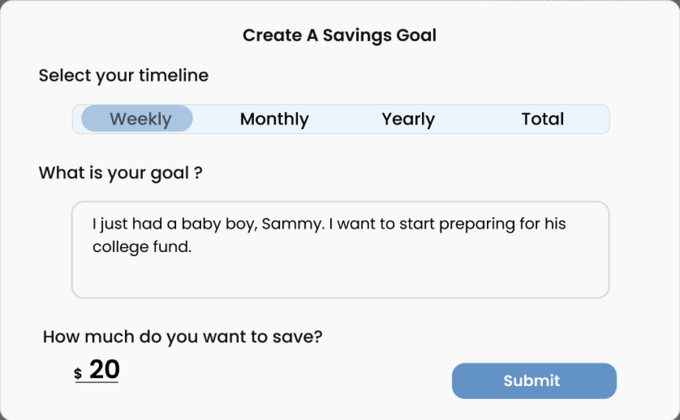
2) Set a savings goal.
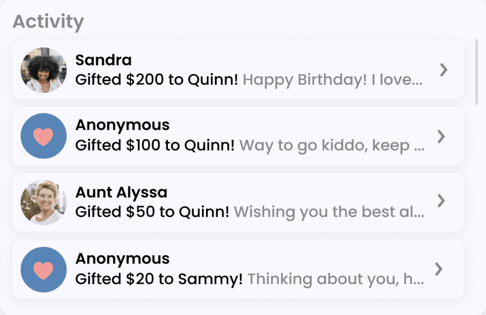
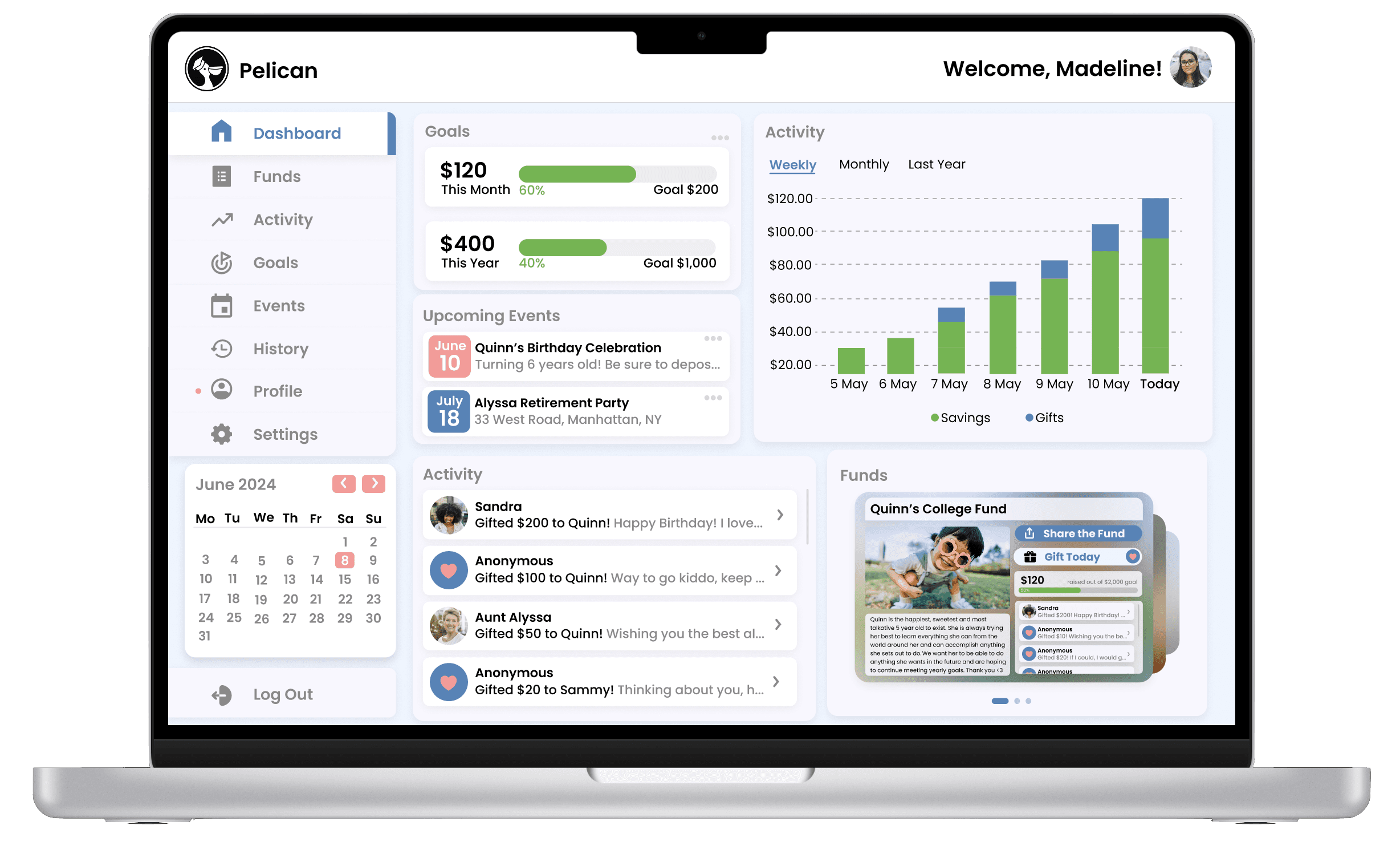
Dashboard Activities
*
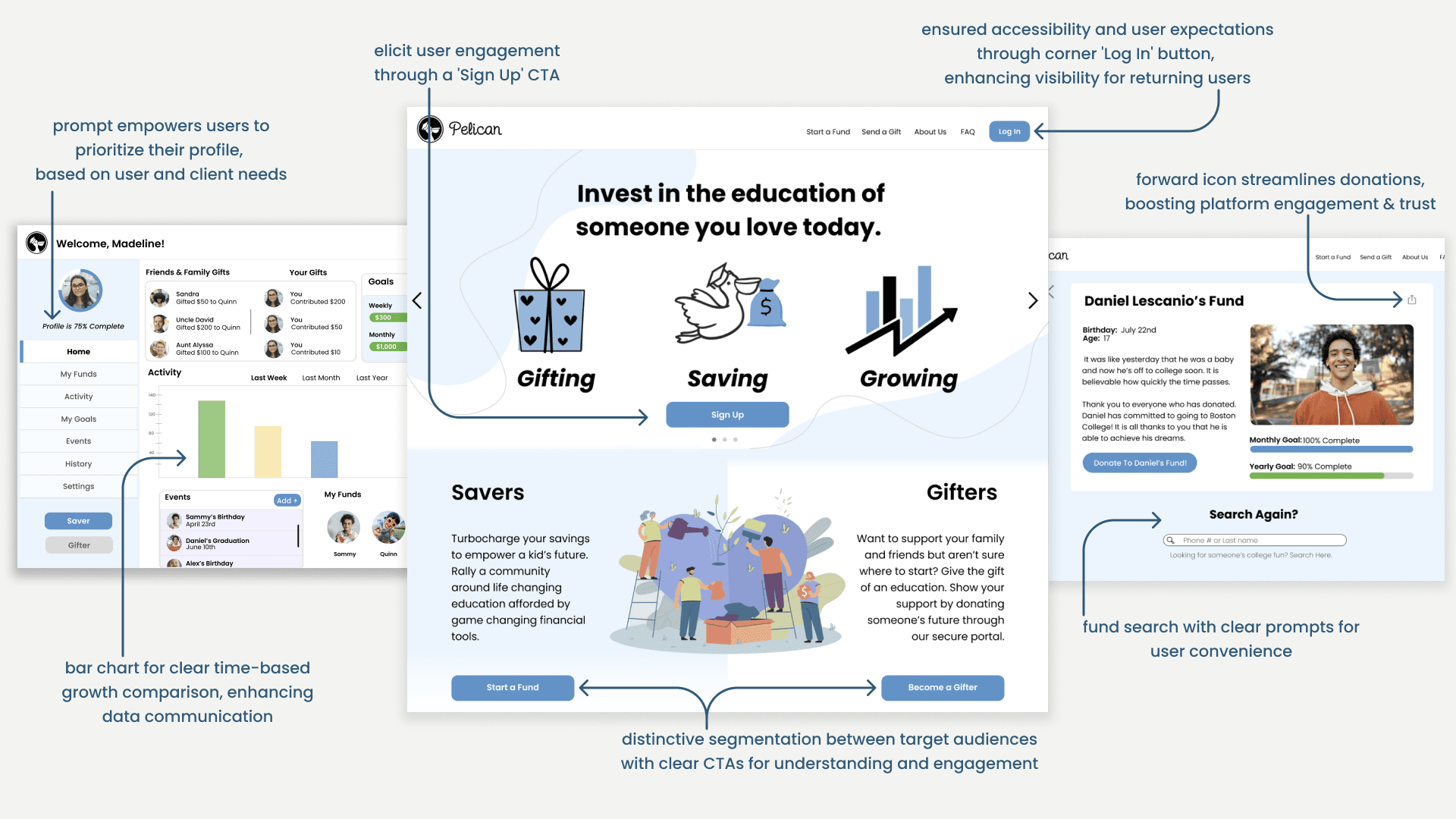
Asterisk denotes elements redesigned post-client project conclusion:
These enhancements were voluntarily undertaken to explore diverse viewpoints and showcase personal professional growth. The original designs included these elements, with modifications made solely to the dashboard interface for demonstrative purposes.
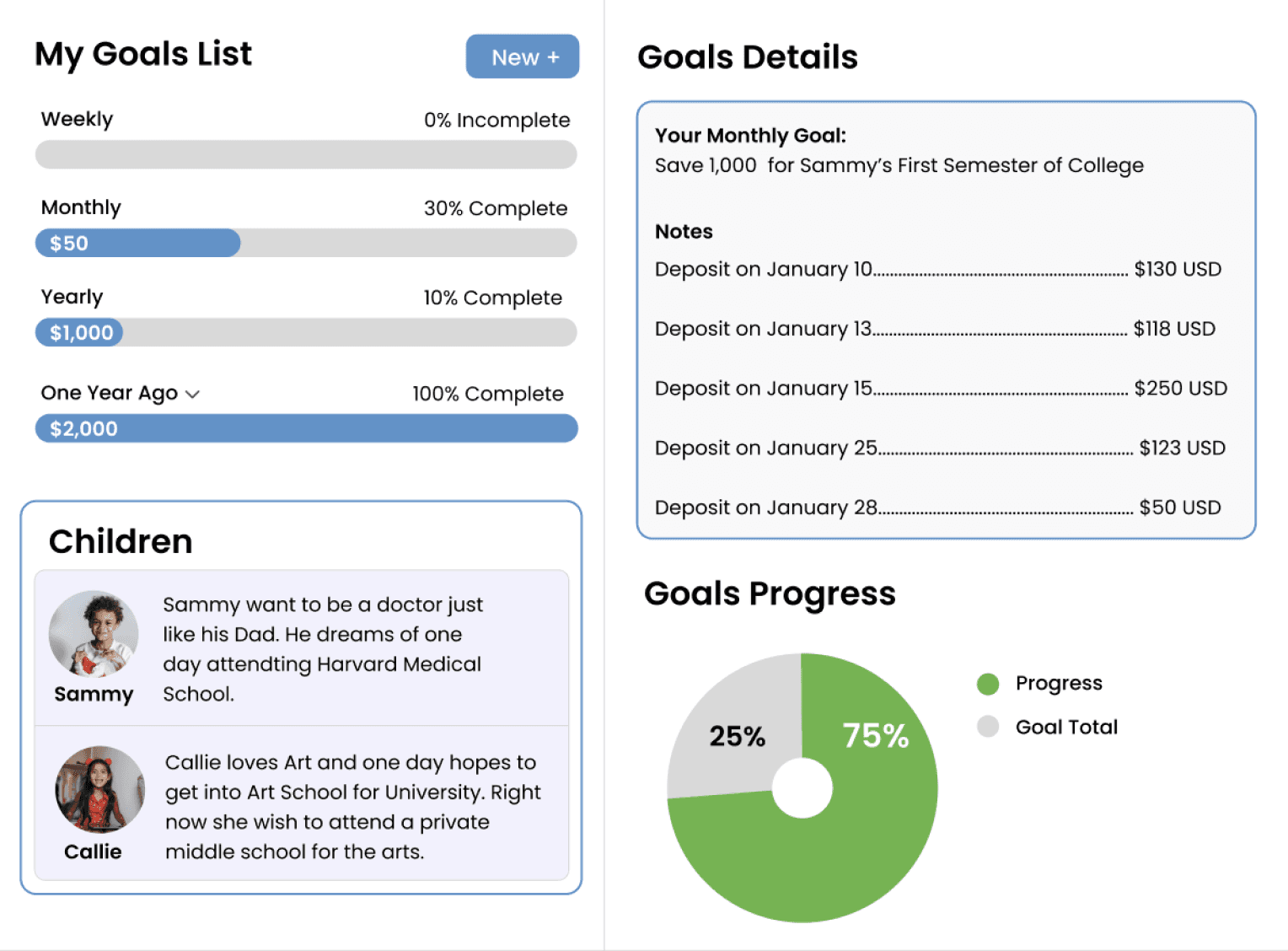
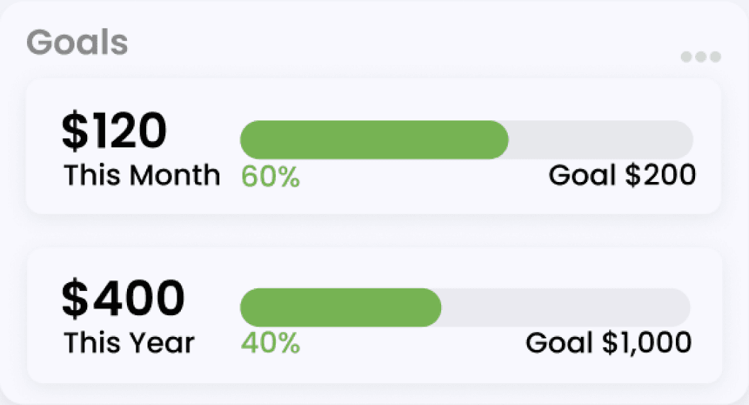
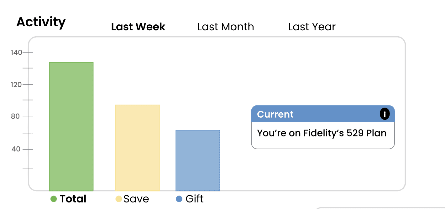
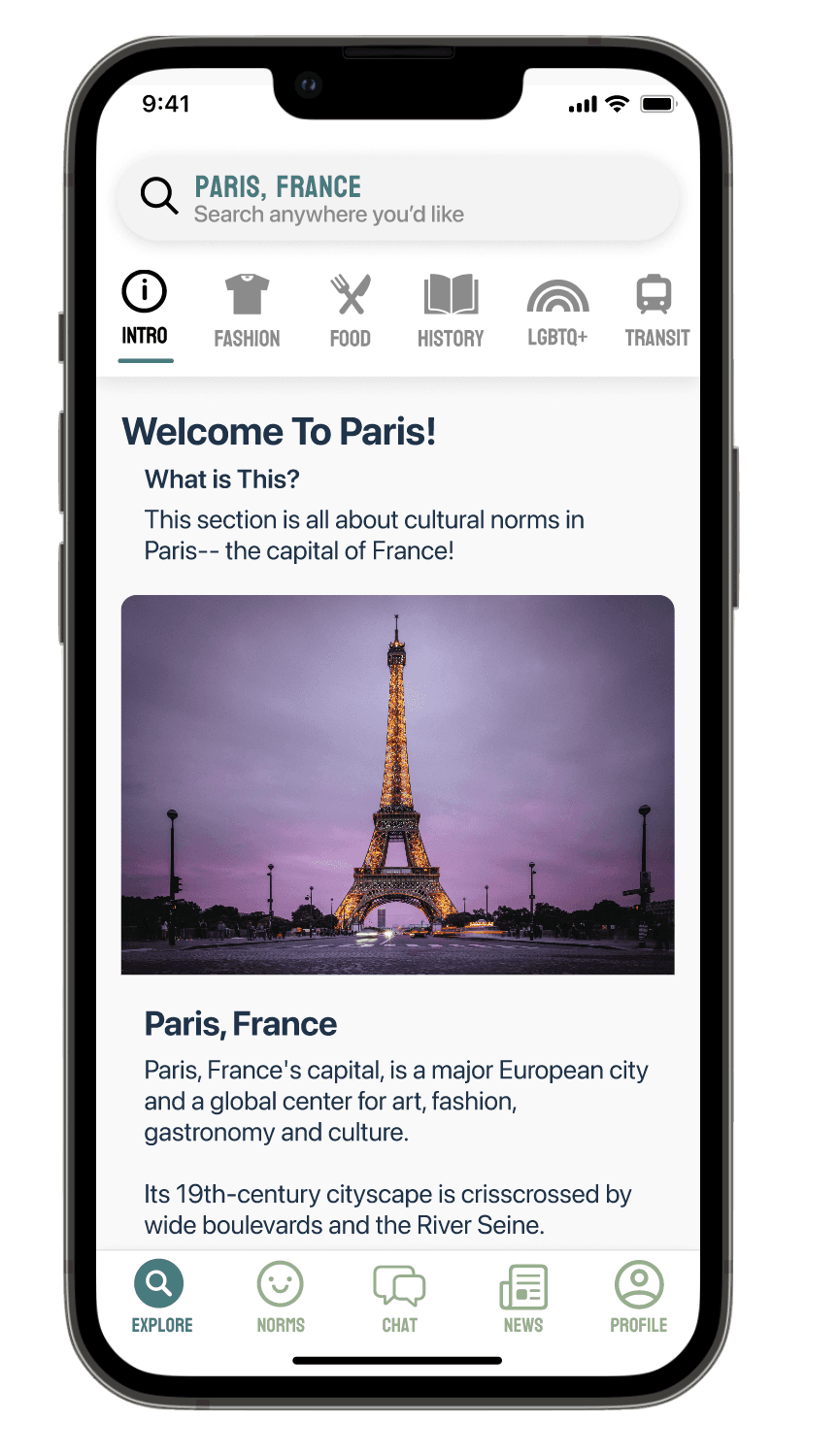
Customizable Savings Goals
*
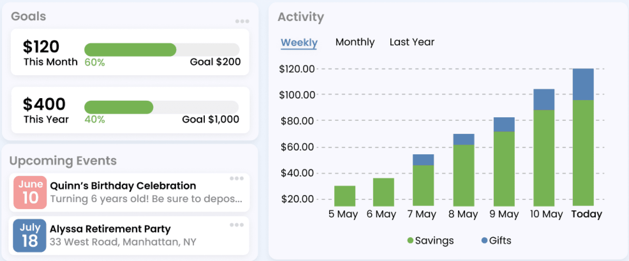
Savings Dashboard
*
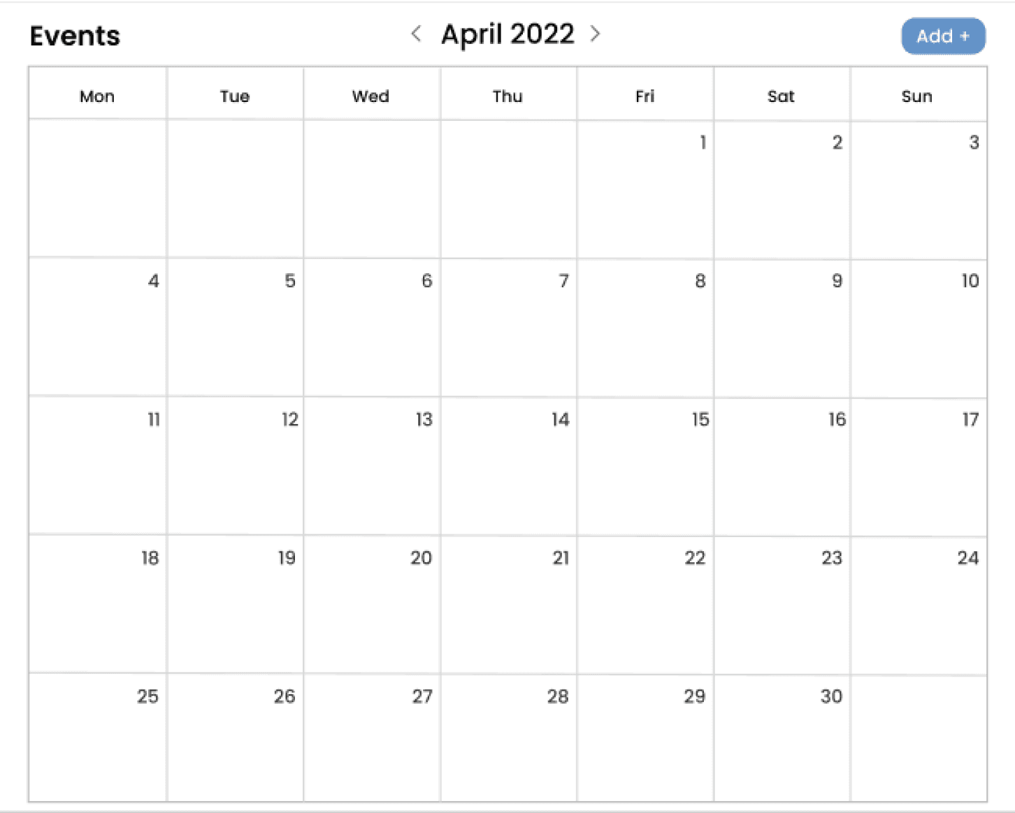
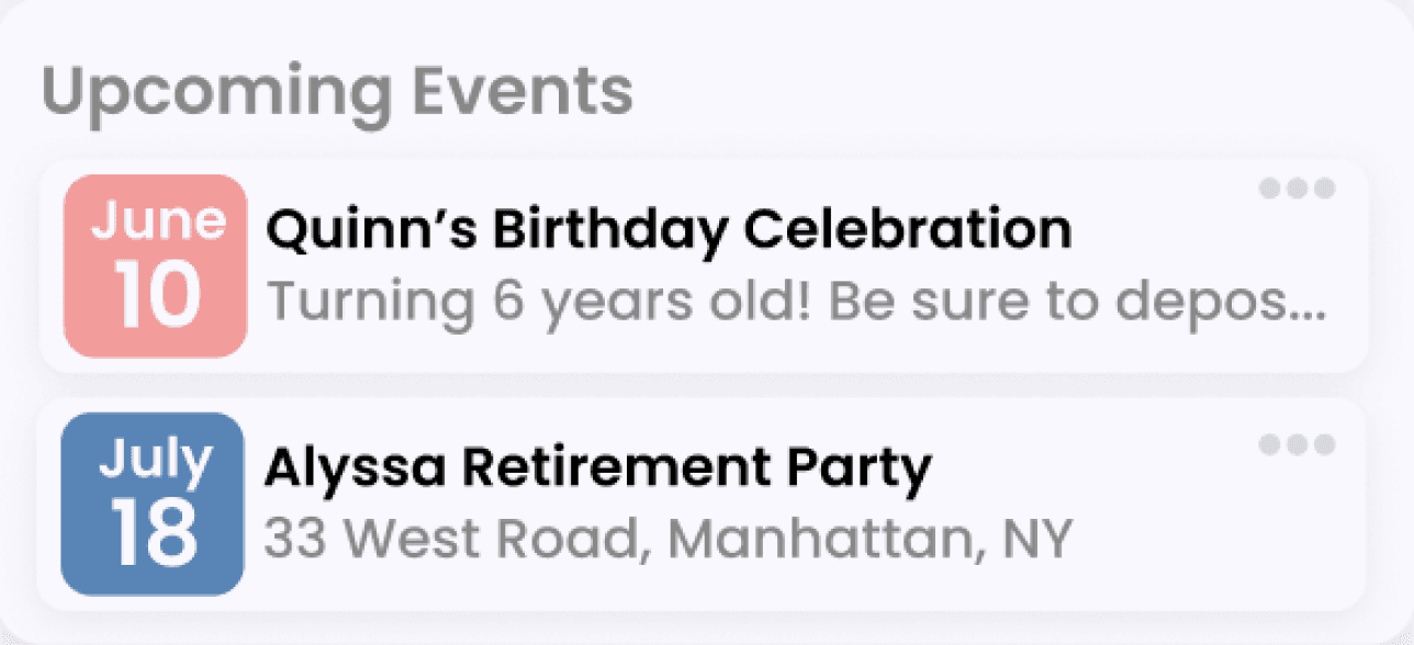
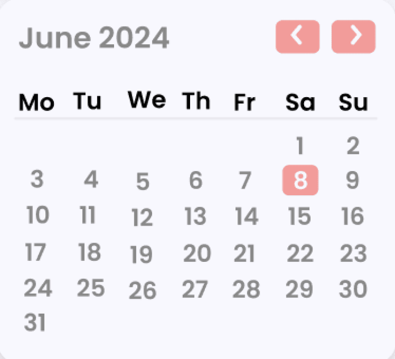
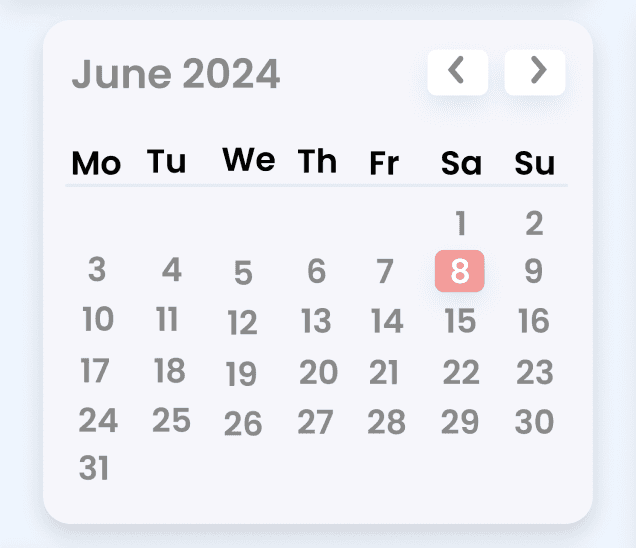
Calendar & Reminders
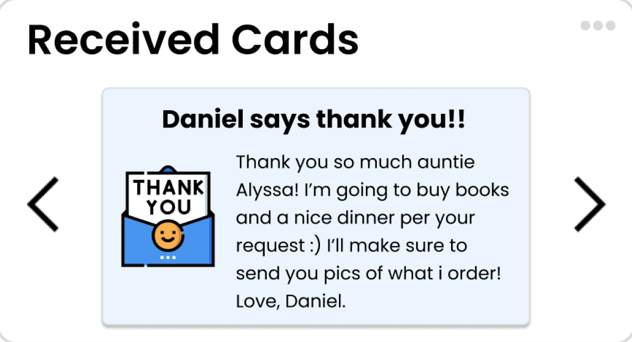
Donation Feed & Visible Impact
*
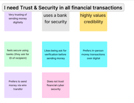
Anonymous Donation Option
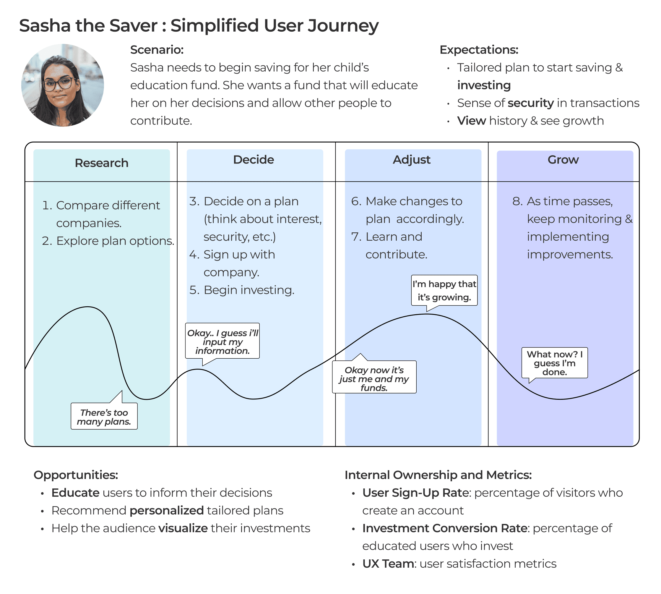
Savers want to see their progress & how much they are contributing
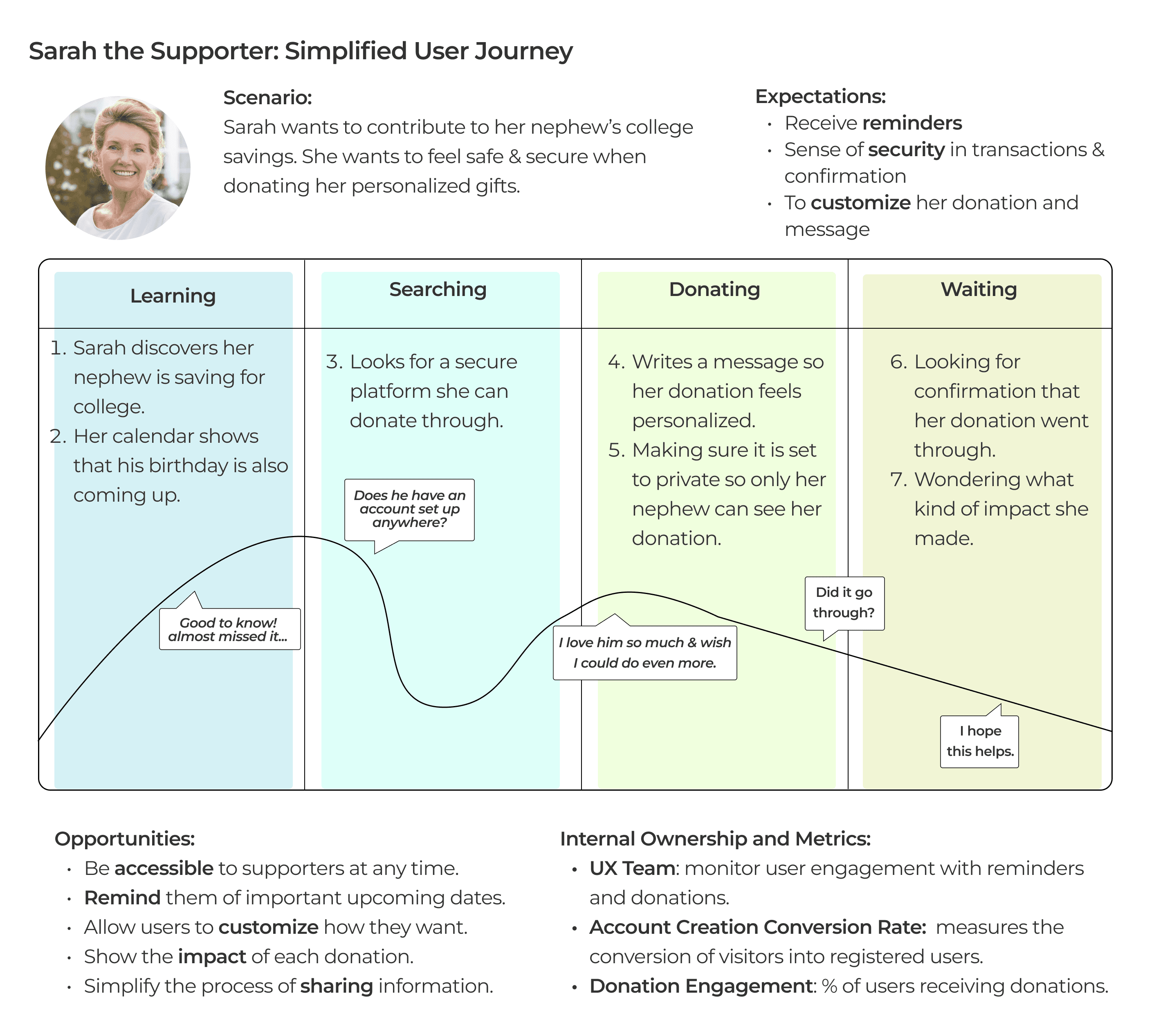
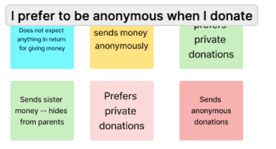
Supporters want to feel appreciated for their donations to family & friends
Users want to be able to organize finances in a more manageable way
Supporters want to a reminded when milestones & occasions come up
People want the option to discreetly send money to friends and family
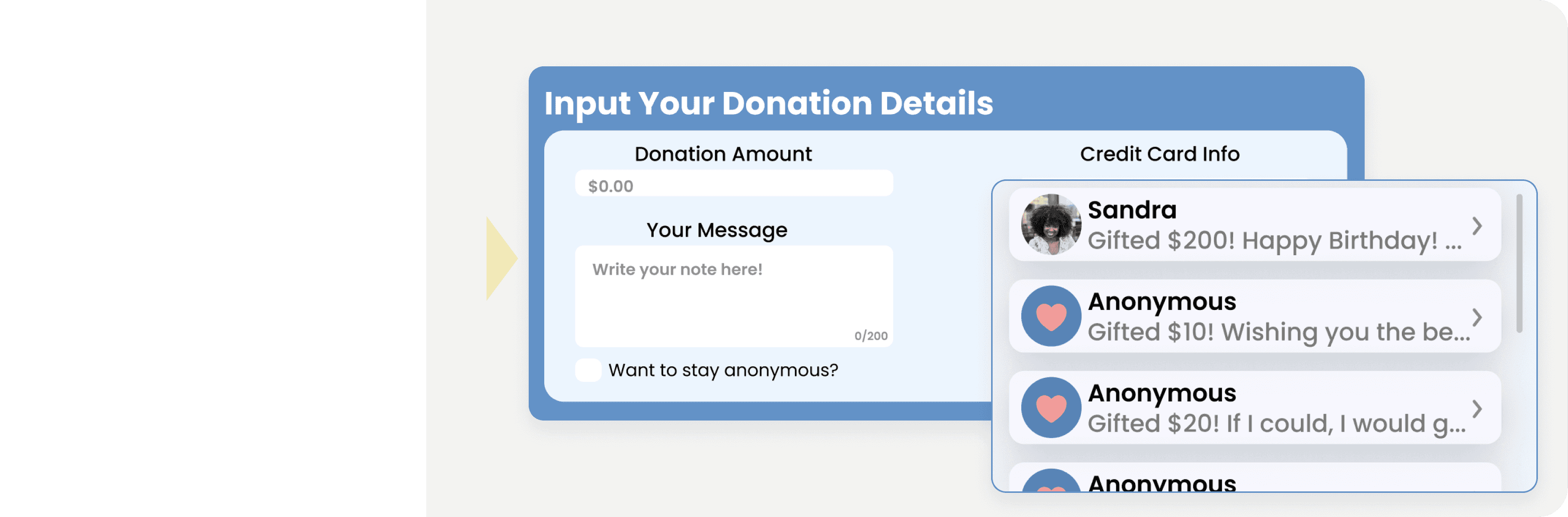
Confirmation Flow
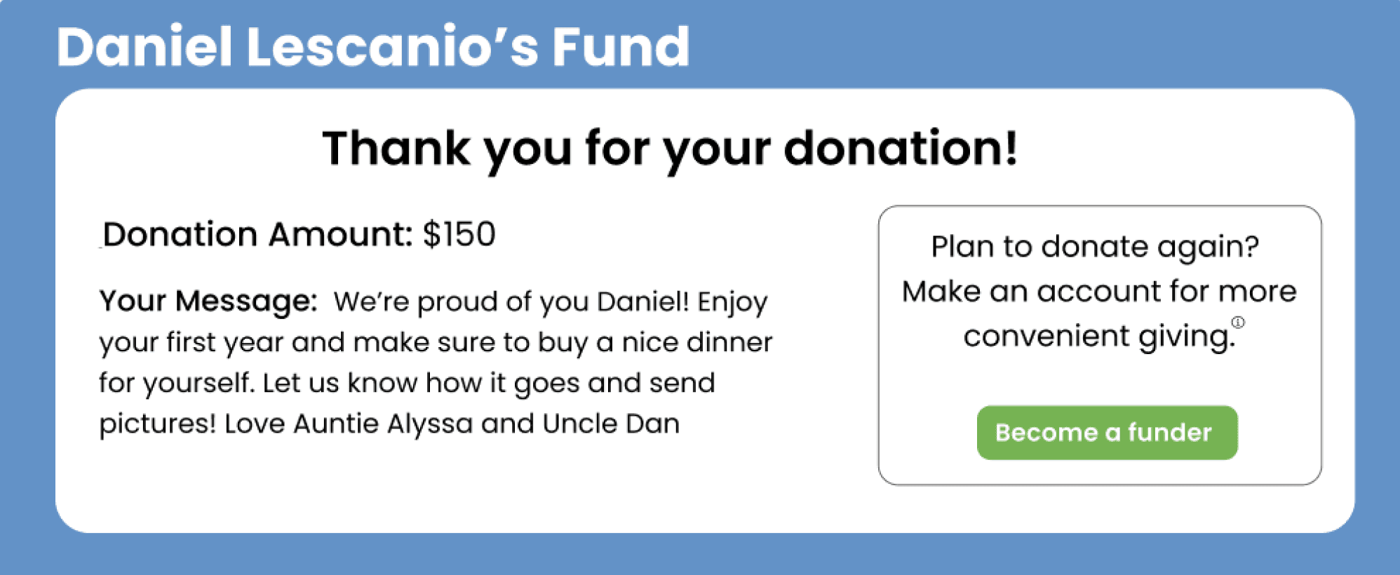
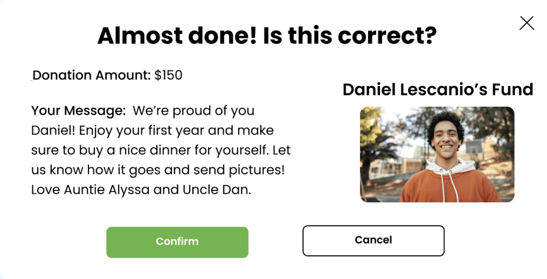
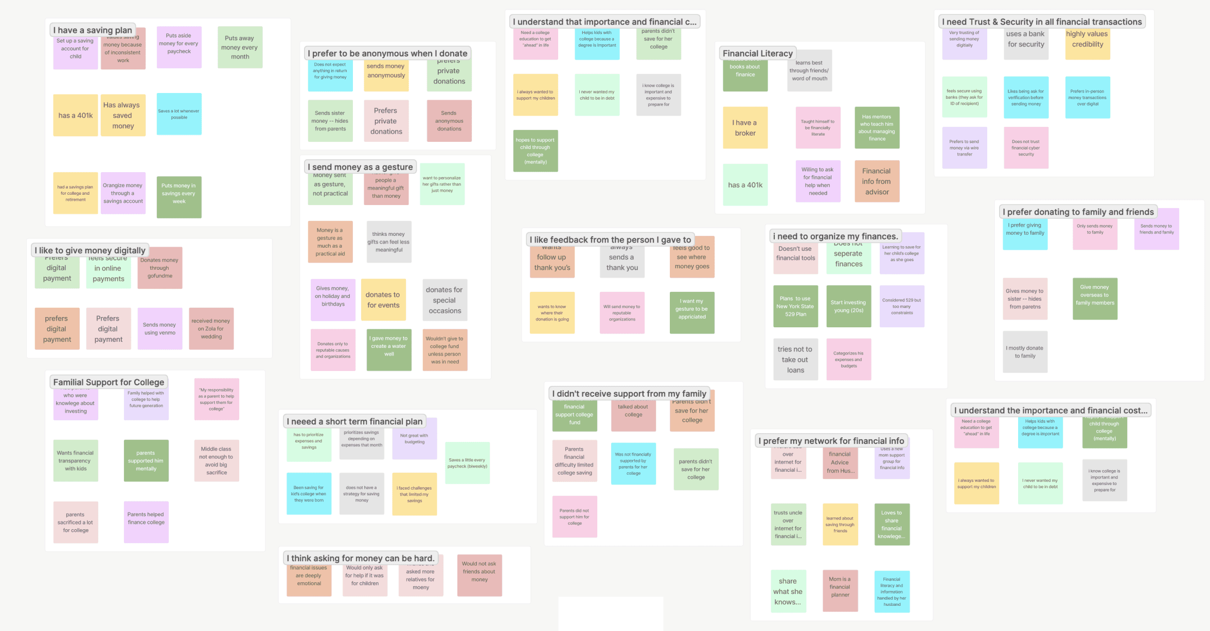
People want to have trust and security in financial transactions
RESEARCH
Features
Actionable Insights
Research to Design: Reflecting on everything we’ve learned throughout the research phase (especially during user interviews) we will draw insights and focus on actionable ones for design inspiration!
Synthesis
*
Persona & Journey
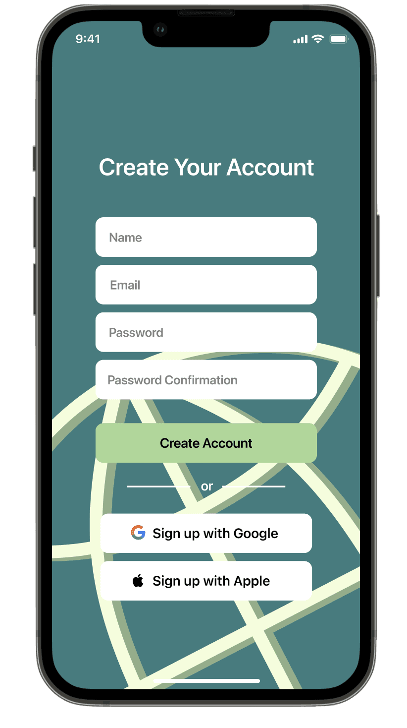
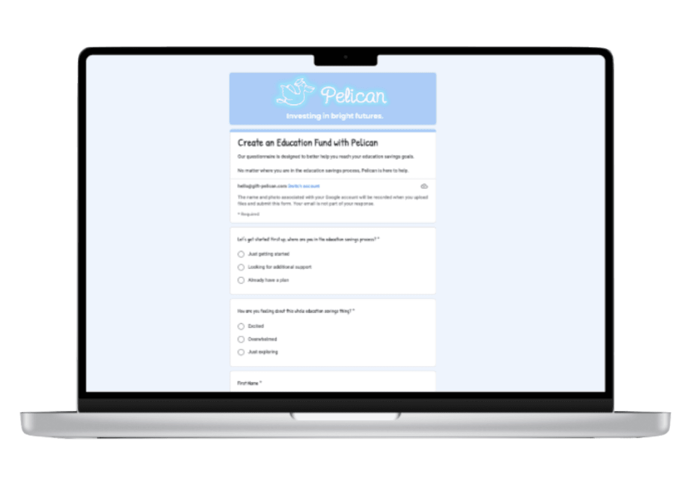
Account Creation
Average of 2 min 49 sec; users wished to save for later.
Overall, lacks credibility and delightfulness.
Missing next steps once form has submitted.
Proactive Communication On Deliverables: effective communication early and often was crucial for project success, especially within strategic initiatives.
Design Studio Needs More Focus: while prioritizing the flow is crucial, for optimal results, leveraging design studio sessions to concentrate on specific features or pages can yield more effective outcomes.
Client Familiarity with Design Processes Matters: clients were not accustomed to ideating or designing which influenced our approach towards feature prioritization.
Incorporating online inspiration searches could enhance future projects' creative input & align client expectations; focus on prioritization.
Proactive engagement with clients ensures alignment and helps foster a collaborative environment conducive to innovative solutions.
increased by 4.8%
originally 4.5/5
4.7/5
Easiness
81%
Faster
signing up for an account & starting a fund
The high level objective of the study is to conduct user and business research in order to identify key focuses in product development. This project focuses on uncovering user issues, developing new flows & iterative testing.
Disclaimer: This does not cover the full extent of my research but rather serves as an overview of key findings and main methodologies.
My Role: Lead UXR & Designer
Framework: Agile
Timeline: January 2023
Tools: Figma, Zeplin, Google Spreadsheet/ Survey, Zoom, Notion, Otter
Methods: Business Analysis, User Interviews, Google Survey, Usability Testing, Competitive Feature Analysis
Iterative & Exploratory Product Research/ Design
Market Exploration, Product Development & Testing
@ Pelican Invests
Methods
synthesis
current site testing
business model canvas
user interviews
initial problem statement
hypothesis
key assumptions
competitive feature analysis
persona & journey
feature prioritization
deliverable & testing
design studio
prototype & testing
screener survey
Design
Next Steps
Research
Want to See More?
Check Out Another Case Study!
UX Research & Product Research,
Product Design & Testing
Business research in Airbnb's current marketplace to uncover opportunities for growth in user journey!
Company: Airbnb (Conceptual Project)
Research Methods: Interviews, Business Analysis + Usability Testing
Role: UX Researcher & Designer
When: February 2022
See Project
Designs
Research
NEXT STEPS
We recommend integrating API usage to address these user needs:
Language Focus: The site caters to 2 distinct user groups/needs. While the current terminology uses "gifters" a shift to "supporters" better aligns with user expectations. Testing is necessary to validate this recommendation!
Adoption: Pelican’s most crucial issue is adoption of the site, for that we highly recommend they continue monitoring monthly registration rate metric and testing the onboarding flows.
Research is an ongoing process, so as Pelican aims to continually test and refine critical flows, here are the most critical flows to test & metrics watch:
Offer additional payment options to help users feel more secure.
Donation Flow: testing showed that many savers & supporters wanted the option to register for an account prior to donating or inputing an card information.
Allow users to start an account before donating! Will need to develop out this flow and overall continue enhancing the onboarding process.
Background & Goals
The Challenge
Need for Evidence-Based Decision Making
Utilize concrete research for development
Establishing Trust & Security
Ensure financial safety
Foster confidence
Limited Customer Base
Expand audience
Maintain mission
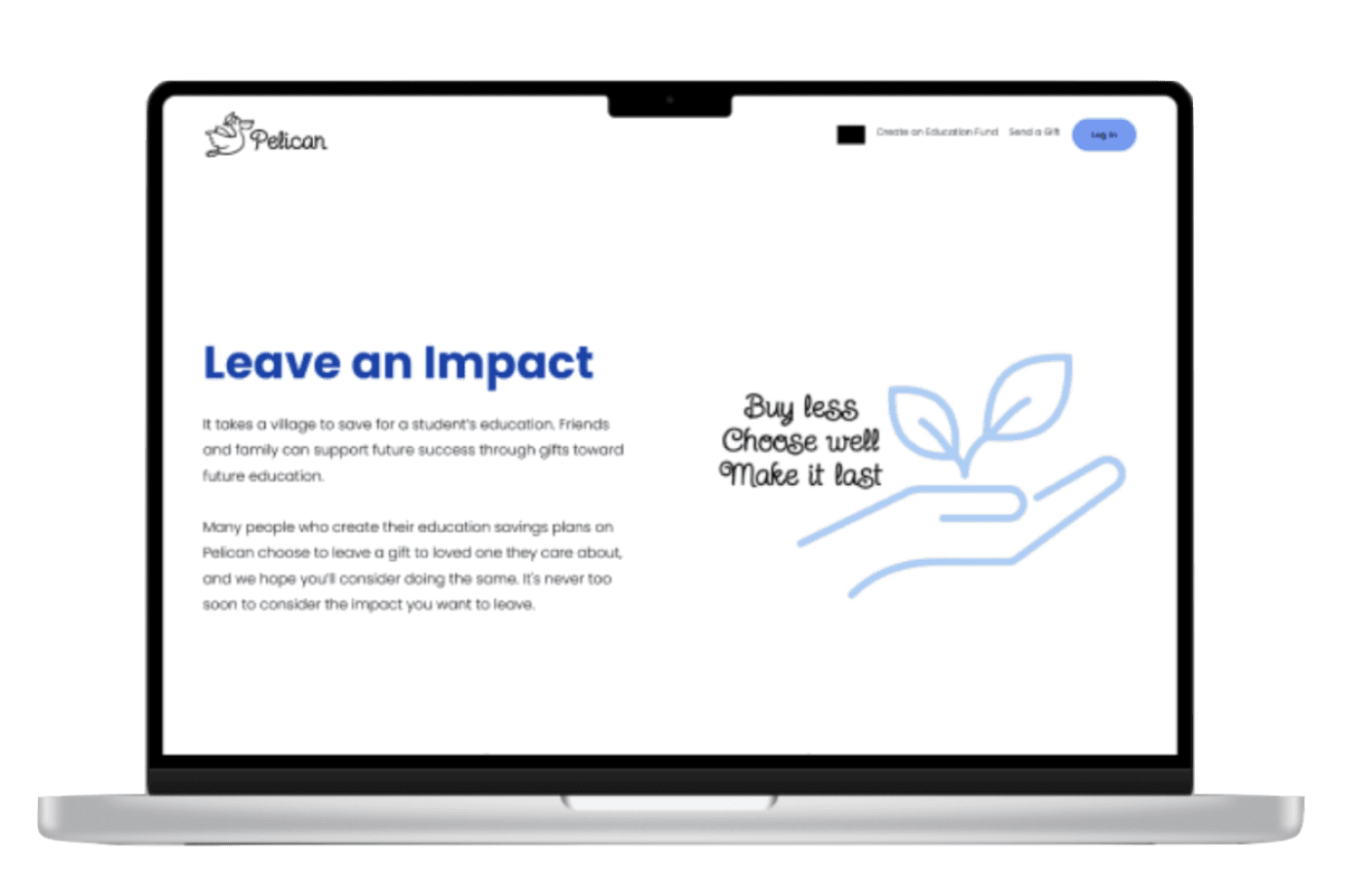
The Client
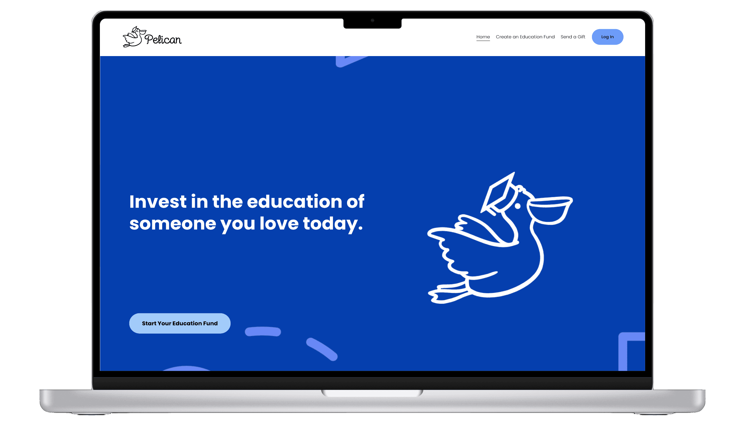
Pelican Invests is an investing platform dedicated to empowering parents in securing their children's educational futures. Their mission is to simplify the complex process of saving for education while providing valuable financial education resources.
Evaluate the usability and effectiveness of the current Pelican Invests website in meeting the needs of parents interested in educational fund investing.
Test the onboarding process to identify areas for simplification and improvement.
Develop a user-friendly dashboard feature that provides parents with easy access to key information about their children's educational funds, including current balance, investment performance, and contribution history.
Understand our target audience’s workflow when performing interactive tasks using Pelican Invests.
Explore how parents currently involve family and friends in the educational fund saving process, and uncover any barriers to involvement.
Our Goals
What did we want to solve for?
Generative Research Goals
Design Research Goals
Client Goals
Design Impact
when it comes to goal setting
18% More Success
MY PROCESS
I practice IDEO’s Human-Centered Design process, as well as an Agile design process, to ensure my decisions were based on and supported by user research (needs/ behaviors) & feedback.
Understand Your User
Where’s The Problem?
Generate
Ideas
Build Your
Ideas
Get User Feedback
iterate!
EMPATHIZE
DEFINE
IDEATE
DESIGN
VALIDATE
Interested In Learning More About My Methods?
Please Keep Reading :)
business model canvas
initial problem statement
hypothesis
key assumptions
competitive feature analysis
screener surveys
user interviews
Who are Sasha & Sarah?
Sasha & Sarah are personas created based on research to help us keep our target audience in mind!
We have both, the saver and the supporter.
Saver Journey Map
Saver Persona
Supporter Persona
Supporter Journey Map
Research Impact
Strategic Impact
Research findings played a pivotal role in guiding strategic decisions throughout the project timeline.
Despite constraints, Research enhanced user satisfaction and alignment with business goals, leading product success.
Product Impact
By collaborating in an agile community, designers are able to quickly incorporate feedback from research.
Streamlined onboarding process by 81%, leading to faster entry into the tool and increased user satisfaction (by 60%).
Efforts are reflected in the significant efforts made to design, development, & improve key features; resulting in a more intuitive and user-friendly experience.
What was the impact of the UXR/D Process?
Research Takeaways
Increased alignment and better decision-making observed during feature prioritization meeting with the software engineer and the CEO, fostering improved collaboration.
Stakeholder Collaboration Impact
My Learnings
What I Learned & How I’ll Use It
Tasks & Key Insights
Gifting to Someone
No clear CTA on page to prompt users donate.
Users reported not feeling gratified through their donation.
Also lacking credibility, room for improvement in user easiness ratings.
lacking credibility
missing confirmation of submission
no clear CTA on landing page
users reported a lack of delightment
no CTA to donate
took almost 3 minutes to complete flow
Current Site Testing
The main problem: Pelican is still in the process of launching their dashboard and automating onboarding (currently a form). Current site testing is minimal due to development but valuable!
Our goal is to learn about users and in the process uncover issues + discover opportunities!
We recruited 10 potential Savers & Supporters, age range from 25-62, for testing in person & over zoom.
People want to have trust and security In financial transactions
Users want to be able to organize finances in a more manageable way
Savers want to see their progress and how much they are contributed
Savers
Supporters
Users want to be reminded when important milestones and occasions occur
Supporters want to feel appreciated for their donations to family and friends
People want to be able to discreetly send money to friends and family
User Interviews
Key Insights
What did our target audience say?
“I was skeptical filling out a form.”
“I wanted help, but this was taking too long.”
“I don’t trust it enough to input my card information”
“I wanted to use the FAQ’s but couldn’t find them.”


“I wanted help, but this was taking too long.”
We created a discussion guide & after sending out a screener survey, we conducted 12 interviews with the ideal user. Then, we affinity mapped to find themes and insights.
Preliminary Research
Prototyping, Testing & Deliverable
What are the tasks?
Uncover Problems
Discover Opportunities
Learn About Users
Why?
Potential Savers & Supporters
Age Range: 25 - 62
Who?
2 Rounds
10 Users Per Round
Tested Over 2 Days
How Long?
In Person
Remote, Over Zoom
Format?
1) Sign up for an education fund.
2) Create an account to support.
Account Creation
1) Locate Daniel's saving fund.
2) Donate any amount to said fund.
Supporting Flow
Key Takeaways
Need for supporter flow: Users couldn't create a donation account without first making a donation, disrupting the user flow.
Ensured functionality: Refined all buttons for seamless interaction, prioritizing user experience. Notably, the login button's start-fund route was the focus but testing proved log-in just as necessary.
Recommended brand cohesion: Suggested color scheme adjustments to better reflect Pelican's values, enhancing visual consistency and user engagement.
increase in avg success
+0.25 increase in easiness rating
less time on task
Key Takeaways
Calendar: Users expected to click on calendar to create an event, that functionality was built out.
Readability: Boosted font size across the dashboard for improve user accessibility.
Labeling: Identified & fixed unclear labels (specifically donation process) based on user feedback.
Calendar event display: Need to reconsider presentation of events with consideration to multiple events on the same day.
Key Takeaways
User Exploration: New users expressed a desire to explore the site! which could have affected time.
Clarifying Language: Some confusing terminology, notably between "savers" and "gifters," prompting the need for language refinement (my suggestion is to change “gifters” to “supporters”)
Account Creation Priority: Many users indicated a preference for starting an account before searching for a fund.
Increased Time: Due to adding additional screens to digitize the onboarding process, time increased.
Mid-Fi
Final Product!
Final Product!
Final Product!
Task 1: Account Creation
Task 2: Dashboard Activities
Task 3: Supporting Flow
+16%
4.85/5
-7.8s
Mid-Fi
Mid-Fi
All scores are improvements from the original site (current site testing found in earlier section)!
increase in avg success
-0.17 decrease in easiness rating
less time on task
+12.5%
4.8/5
-2.8s
increase in avg success
-0.15 decrease in easiness rating
more time
on task
+5%
4.6/5
+10.3s
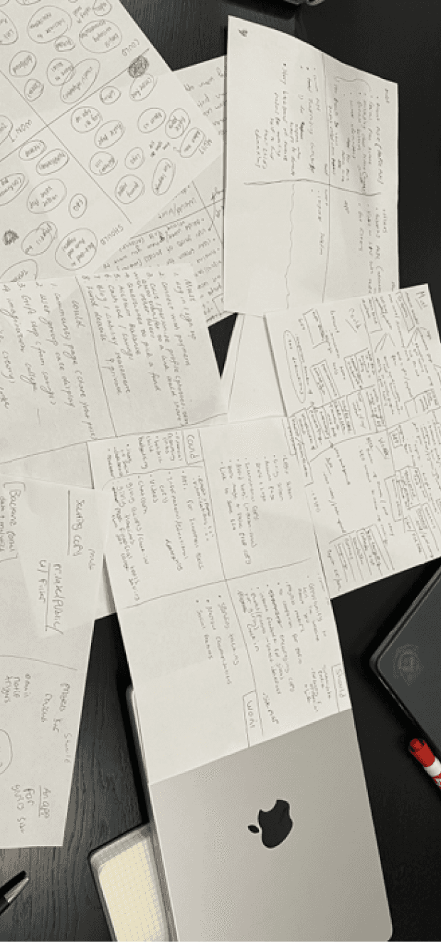
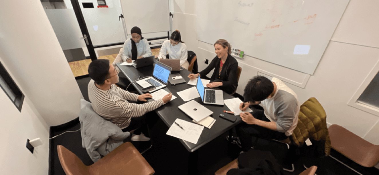
Multiple rounds of design studio facilitated synchronized decision-making on feature priorities by fostering structured ideation session. Through individual sketching, feedback exchange, and collaborative synthesis, we efficiently converged diverse ideas into a cohesive low-fidelity wireframe.
Design Studio
Client Collaboration
Creation of Multiple Flows:
account creation, dashboard
activities, donation flow, etc.
3 Rounds of Design Studio
DESIGN
The feature prioritization matrix enables efficient allocation of resources by focusing on essential functions with low effort/cost while deprioritizing high effort/cost features that are nice to have, aligning perspectives across marketing, design, executive, and engineering domains.
What come first?
Fund Creation Flow
Donation Flow
Layout of Main-page/ Text
Profile page
Confirmation & Verification Pop-Ups
Saving Dashboard
Gifting Dashboard
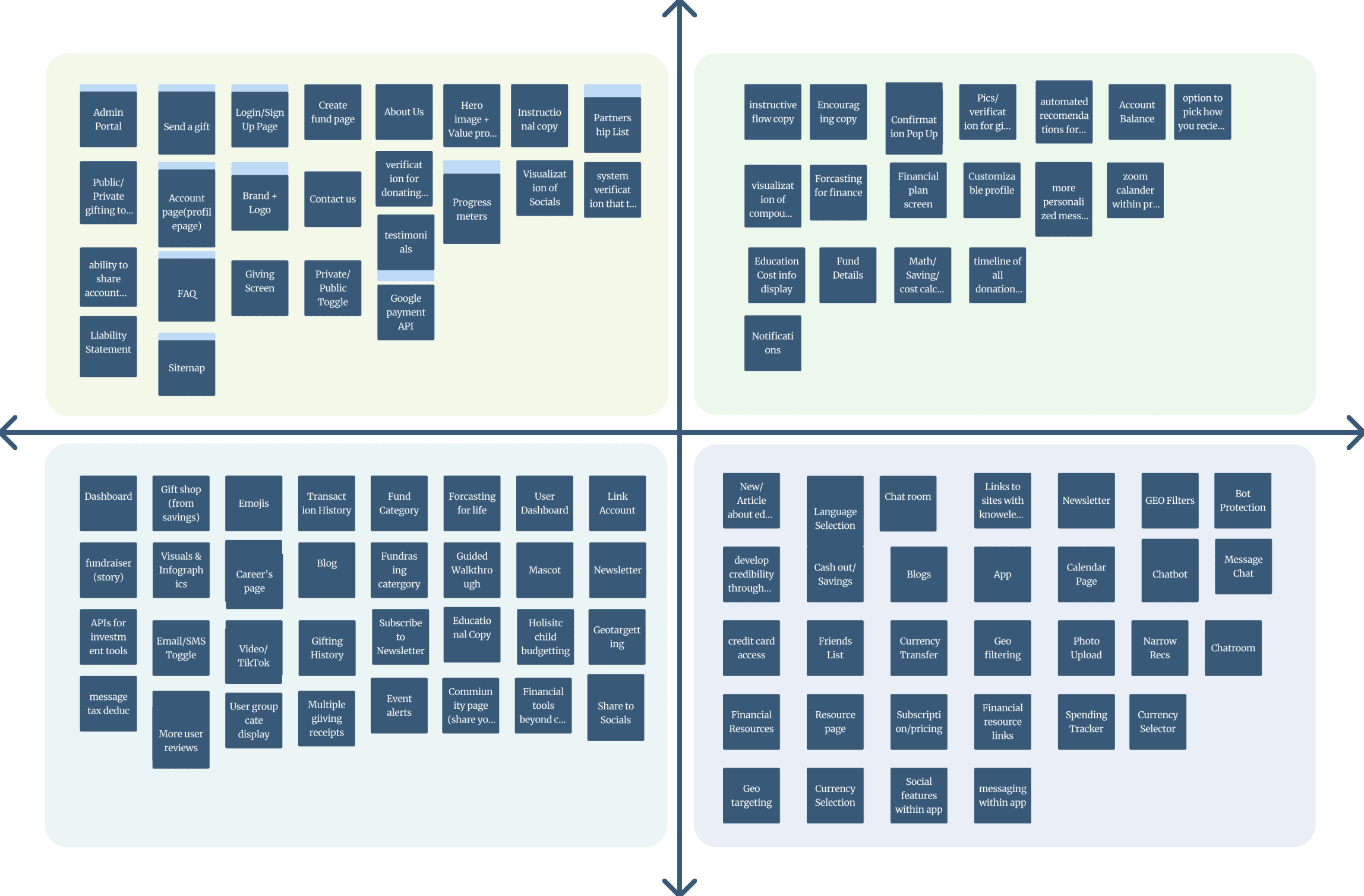
Feature Prioritization
Client Collaboration: feature prioritization with clients was immensely beneficial in fostering alignment
Key Takeaways
Hypothesis, Assumptions & Problem Statement
BMC, Competitive Feature Analysis
I’d love to hear from you!
Welcoming potential collaborations & exchanging of ideas.
Resume
ux.biancaa@gmail.com
@bianca-asencio